UCAL refresh
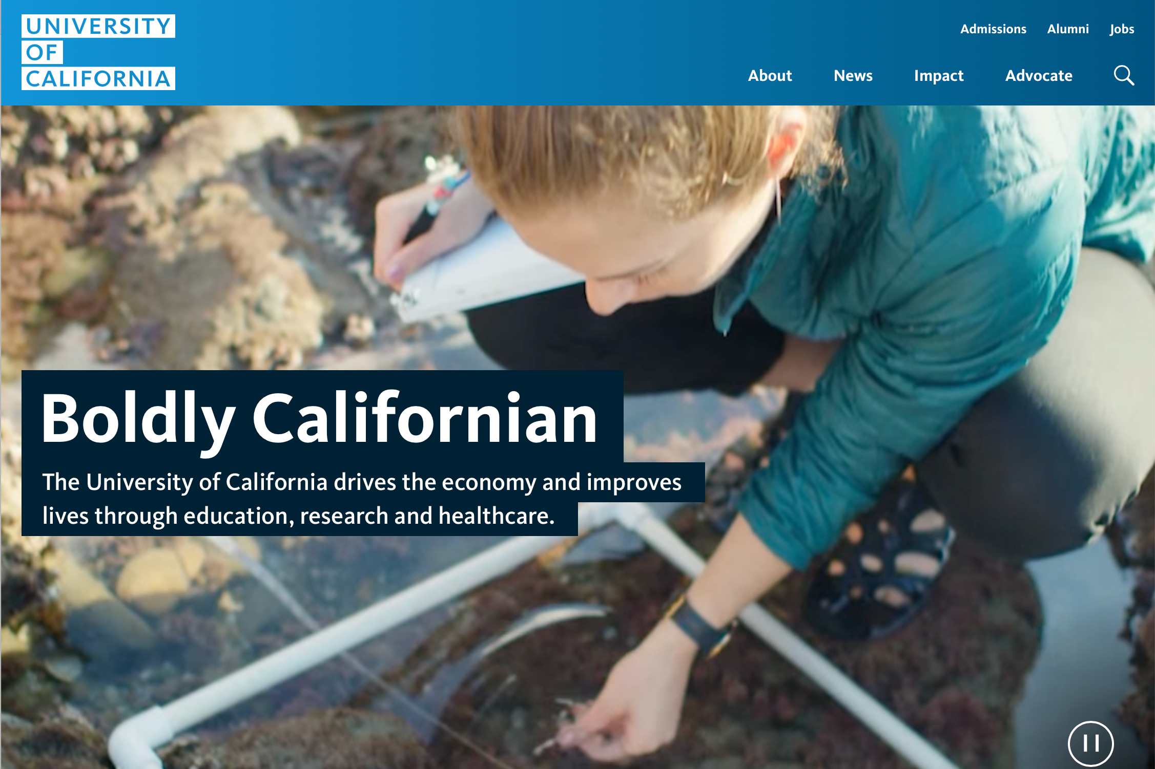
After five years without a major redesign, the University of California’s flagship website needed a content and structural refresh. The goal was to align the site with current communication priorities, make content easier to discover, and build a more sustainable foundation for ongoing updates.
Challenge
Much of the site’s content had grown outdated and difficult to maintain, in part because it relied heavily on static custom pages. The information architecture needed to be rethought so content could stay current and so timely, relevant stories could be surfaced more easily.
Approach
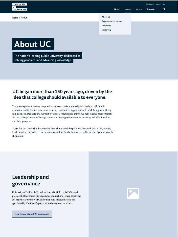
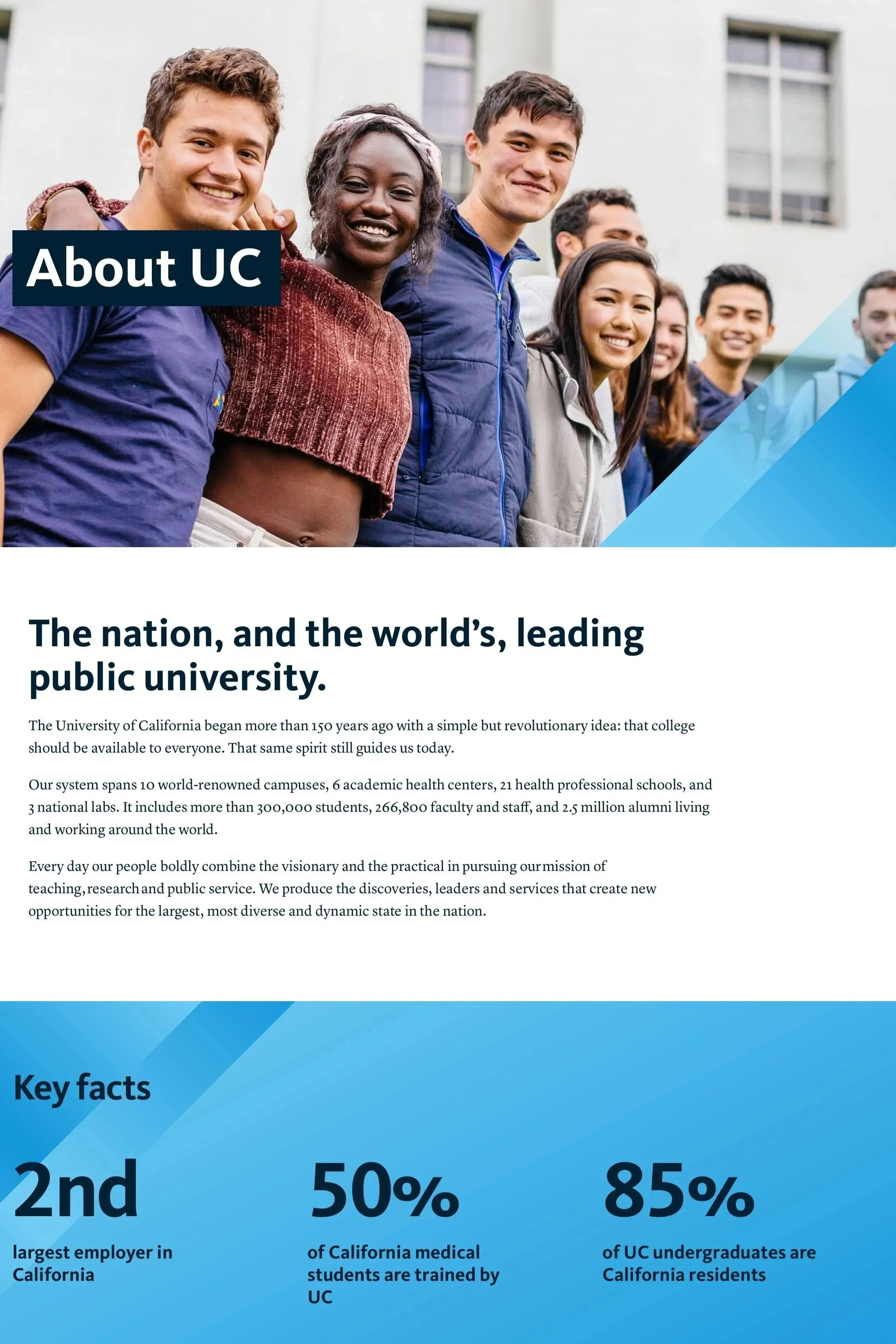
Directed the development of a new sitemap and content strategy with the content strategist, significantly simplifying navigation and creating clearer paths to priority content.
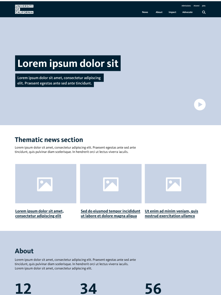
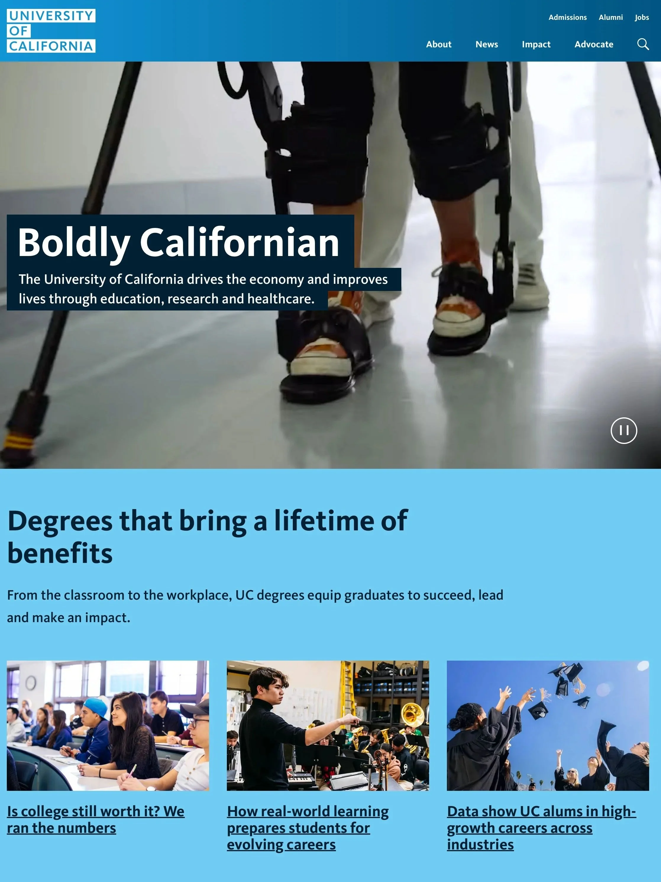
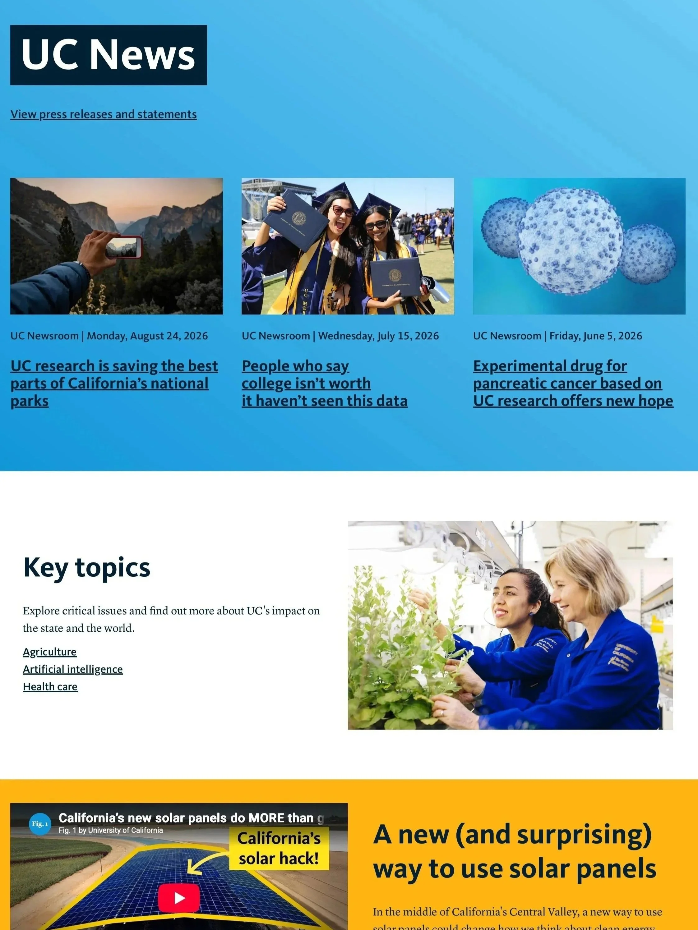
Led wireframing and visual design for a refreshed set of page templates, creating a cleaner, more scannable experience that would also be easier for content teams to maintain.
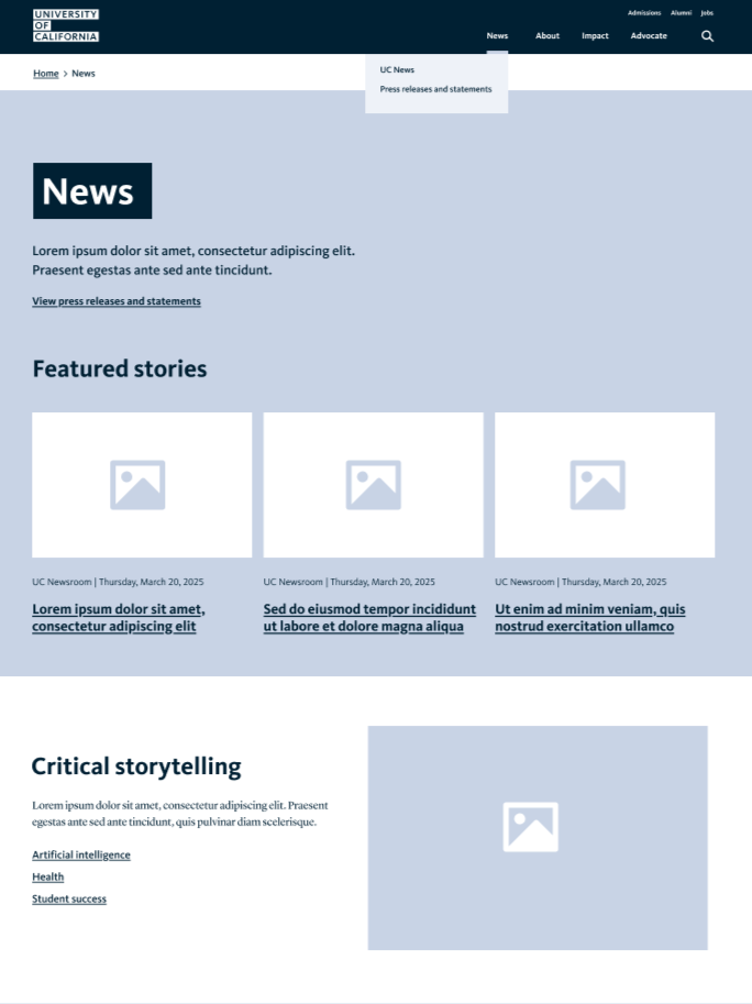
Designed a new flexible template that elevated news as a central part of the site experience, creating more opportunities to showcase a wider range of stories and initiatives.
Designed the new templates around the needs of both audiences and internal content teams, creating a foundation that could support ongoing publishing and future iteration rather than another one-time redesign.
Outcome
The refresh gave the flagship site a clearer content hierarchy and more focused navigation. Within the first three months post-launch, new users increased by 10% and engagement rose by 5%, reflecting improved discoverability and a stronger connection between visitors and the site’s content.